
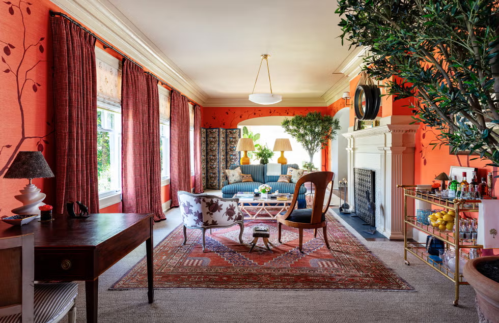
Walk into a room painted in crisp white with neutral furniture, and it may feel calm and elegant. Step into another space filled with emerald green accents, deep navy walls, burnt orange cushions, or mustard yellow artwork, and the mood changes immediately. Color has that kind of influence. It shapes the atmosphere of a home before anyone notices the furniture or decorative details.
That is one reason bold color home decor has become one of the most searched interior design trends in recent years. Homeowners are looking for ways to create spaces that reflect personality instead of copying picture-perfect rooms that all seem to look alike. Rather than treating color as something risky, many designers now encourage people to see it as a design tool that brings warmth, energy, and individuality into everyday living.
The popularity of this style isn’t limited to one type of home. It appears in modern apartments, traditional family houses, lofts, studio spaces, and even small rental properties. While every colorful interior looks different, they all share one thing in common—they are designed to leave an impression.
A Quick Answer Before You Pick Up a Paintbrush
What is bold color home decor?
It is an interior design approach that uses rich, vibrant, or highly saturated colors to create visual interest and personality within a space. Instead of relying mainly on neutral shades, this style introduces statement colors through walls, furniture, artwork, textiles, lighting, or decorative accessories while maintaining balance throughout the room.
The goal isn’t to make every surface bright. It’s to use color intentionally so the space feels lively without becoming overwhelming.
Why More Homeowners Are Moving Beyond Neutral Interiors
For years, beige, gray, and white dominated interior design magazines. These shades remain timeless, but many homeowners have started craving something that feels more personal.
Social media has played a role in this shift. Interior designers, decorators, and homeowners now share colorful living spaces that inspire others to experiment with their own homes. Instead of asking, “What color is safest?” people are beginning to ask, “What color makes me feel happiest?”
That small change in thinking has encouraged a more creative approach to decorating.
Many people also discovered during extended periods at home that surroundings affect mood more than expected. A thoughtfully designed room can make daily routines feel more enjoyable, whether someone is working remotely, reading, relaxing, or spending time with family.
The Emotional Side of Living With Color
Color psychology isn’t an exact science, but certain shades are commonly associated with particular feelings.
Deep blue often creates a sense of calm and focus.
Green is frequently connected with nature, balance, and freshness.
Yellow brings warmth and optimism.
Terracotta and rust tones create comfort.
Rich burgundy adds sophistication.
Even black, when used carefully, introduces elegance and dramatic contrast.
Of course, personal experiences influence these reactions. One person may find bright orange energizing, while another may feel it is too intense for everyday living.
That is why successful interiors rarely follow strict rules. They reflect the people who actually live there.
The Details That Most First-Time Decorators Overlook
Adding vibrant color sounds simple until decorating begins.
Many beginners assume the secret lies in choosing one beautiful paint color.
In reality, successful interiors depend on balance.
Color works alongside lighting, flooring, furniture, natural textures, artwork, and architectural details.
For example, a dark emerald wall may appear luxurious in a bright room with large windows. The same shade could feel much heavier in a space with limited natural light.
This is why professional designers often evaluate a room throughout different times of day before finalizing color choices.
Natural morning light and evening artificial lighting can completely change how paint appears.
Personality Often Matters More Than Trends
One interesting observation appears again and again.
Homes with memorable interiors usually reflect the owner’s personality instead of current design trends.
Someone who enjoys traveling may naturally introduce colorful textiles collected from different countries.
An artist may combine unexpected color combinations that would seem unusual elsewhere.
Families with young children often embrace cheerful shades that create energetic spaces.
Meanwhile, someone seeking a peaceful retreat may choose rich earth tones rather than highly saturated primary colors.
There isn’t a universal formula because every home serves different people.
Where Bold Choices Create the Biggest Impact
Many homeowners assume they must repaint every room.
Fortunately, that’s rarely necessary.
Sometimes one carefully selected feature creates more visual interest than an entire colorful house.
Accent walls remain one of the most effective approaches.
Colorful sofas immediately become conversation pieces.
Statement armchairs introduce personality without dominating the room.
Large artwork can transform neutral spaces.
Patterned rugs bring multiple shades together naturally.
Even smaller accessories such as ceramic vases, lamps, cushions, or curtains can refresh a room without major renovation.
These smaller updates also allow homeowners to experiment before making larger design commitments.
Texture Makes Strong Colors Feel Softer
An important design lesson often surprises beginners.
Texture influences color almost as much as the color itself.
Velvet reflects light differently than linen.
Matte paint creates a softer appearance than glossy finishes.
Natural wood balances vibrant walls.
Stone, woven baskets, ceramic pottery, and indoor plants introduce organic textures that prevent colorful interiors from feeling artificial.
Without texture, bright colors sometimes appear flat.
With layered materials, they become richer and more inviting.
The Middle Ground That Designers Recommend
Many experienced decorators follow a practical strategy rather than filling every corner with vibrant shades.
Some helpful ideas include:
- Choose one dominant statement color instead of several competing shades.
- Pair vibrant colors with natural wood or neutral furniture.
- Repeat accent colors throughout the room for visual harmony.
- Test paint samples before committing to an entire wall.
- Consider how daylight changes color during different hours.
- Allow empty visual space so colorful features can stand out naturally.
These small decisions often make the difference between a room that feels stylish and one that feels visually overwhelming.
Why Expensive Furniture Isn’t Always Necessary
One misconception surrounding colorful interiors is that they require luxury furniture or designer collections.
That simply isn’t true.
Many beautiful rooms combine affordable furniture with thoughtful color planning.
A secondhand wooden cabinet can become a statement piece after being painted deep navy.
Vintage chairs often gain new life with colorful upholstery.
Even inexpensive shelves look more sophisticated when paired with carefully selected decorative objects.
Creativity frequently matters more than budget.
Some of the most memorable interiors are built gradually over several years rather than purchased all at once.
What Social Media Doesn’t Always Show
Online inspiration is useful, but real homes function differently than carefully styled photographs.
Many images are professionally edited.
Lighting is adjusted.
Rooms are cleaned and staged.
Decorative accessories are arranged perfectly.
Daily life introduces books, toys, laptops, charging cables, and other ordinary items that photographs rarely include.
Because of this, homeowners shouldn’t expect exact copies of online interiors.
Instead, inspiration works best when adapted to personal lifestyles.
A colorful room should still feel comfortable enough for everyday living.
When Decorating Starts Becoming More Challenging
As confidence grows, people often become tempted to add more and more colors.
Ironically, this is where many interiors lose their balance.
Every room benefits from moments of visual rest.
Neutral flooring, white ceilings, wooden furniture, or simple textiles give stronger colors room to breathe.
Professional designers frequently describe this as creating rhythm throughout a space.
Without quieter elements, even beautiful colors begin competing for attention.
The result can feel busy instead of welcoming.
The Difference Between Bold and Overwhelming
One of the biggest misconceptions is that colorful decorating automatically means loud decorating.
In reality, bold interiors are usually carefully edited.
Each statement color serves a purpose.
Some create contrast.
Others highlight architectural details.
Some simply guide the eye toward an attractive focal point.
When every object demands attention, nothing truly stands out.
Thoughtful restraint often creates stronger visual impact than adding more decoration.
Why This Style Continues to Appeal Across Different Home Designs
One reason colorful interiors have remained popular is their flexibility. They are not limited to one decorating style.
Modern homes often combine deep blues, charcoal, and emerald green with clean furniture and simple layouts.
Scandinavian interiors, traditionally known for soft neutrals, increasingly introduce colorful artwork, accent chairs, or patterned rugs to create warmth.
Bohemian spaces naturally embrace layered colors, handcrafted textiles, woven baskets, and global influences.
Even farmhouse interiors, which are usually associated with whites and wood tones, can feel refreshed with olive green cabinetry, terracotta pottery, or rich navy accents.
This adaptability proves that colorful decorating isn’t tied to a single trend. Instead, it works with different styles when applied thoughtfully.
The Concerns That Keep Coming Up
Every decorating choice has limitations, and colorful interiors are no exception.
One of the biggest concerns is commitment. Painting an entire room in a dramatic shade can feel exciting at first, but tastes sometimes change over time. Repainting is possible, though it requires time and expense.
Another challenge is matching furniture. Existing pieces may not always complement a newly introduced color palette, leading homeowners to replace or update accessories to create harmony.
Strong colors can also make small rooms feel visually crowded if they are used without considering natural light, ceiling height, or room proportions.
These challenges don’t mean bold decorating should be avoided. They simply highlight the importance of planning before making major design decisions.
Safety Isn’t Usually About Color—It’s About the Products You Choose
People rarely connect interior decorating with safety, but material selection matters.
When painting walls, choosing low-VOC (volatile organic compound) or low-odor paints can help improve indoor air quality, particularly in homes with children, older adults, or individuals sensitive to strong chemical smells.
Proper ventilation during painting is equally important. Fresh air helps paint cure more effectively while reducing exposure to fumes.
Furniture, fabrics, and decorative accessories should also meet quality standards, especially if they will be used daily.
Good design should create a beautiful home without compromising comfort or safety.
Why Interior Designers Often Recommend Starting Small
Professional decorators frequently give surprisingly simple advice to homeowners who feel nervous about using stronger colors.
Start with one room.
Or even one corner.
A colorful reading chair, statement artwork, patterned cushions, or painted bookshelf can reveal how comfortable someone feels before larger changes are made.
This gradual approach reduces pressure and often leads to better long-term decisions.
Interestingly, many homeowners who begin with one colorful accent eventually gain the confidence to introduce richer palettes throughout the rest of the house.
Does This Trend Still Feel Relevant Today?
Interior design trends come and go, but expressive spaces continue attracting attention.
Today’s homeowners increasingly value individuality over perfection. Instead of trying to recreate magazine covers, they want homes that feel authentic and lived in.
Sustainability has also influenced decorating choices. Rather than replacing furniture every few years, people are repainting existing cabinets, refinishing vintage pieces, and refreshing older rooms through color.
That shift has helped colorful interiors remain relevant because changing paint or accessories often costs less than replacing entire furniture collections.
As long as homeowners continue seeking creative, personal living spaces, this decorating style is unlikely to disappear.
A Quick Answer for Anyone Still Unsure
Should you try colorful decorating if you’ve always preferred neutral interiors?
Yes—if you approach it gradually. You don’t have to repaint every wall or buy entirely new furniture. Introducing one or two carefully selected colors through artwork, textiles, lighting, or accessories allows you to experiment without making permanent changes. Many people discover that even small additions create a noticeable difference in the atmosphere of their home.
The Practical Value Beyond Appearance
Beautiful rooms are enjoyable to look at, but practical value matters just as much.
Thoughtfully chosen colors can help define different areas within open-plan homes, making living, dining, and workspaces feel more distinct without building physical walls.
Color also helps highlight architectural details such as fireplaces, alcoves, shelving, or decorative molding.
In family homes, brighter accents may create cheerful communal spaces, while softer, deeper shades encourage relaxation in bedrooms or reading areas.
These design choices influence how people experience a home every day rather than simply improving its appearance in photographs.
Why Personal Confidence Is the Missing Ingredient
Decorating advice is useful, but confidence often matters more than following trends.
Some homeowners naturally prefer quiet, minimalist interiors.
Others enjoy dramatic combinations that immediately capture attention.
Neither approach is more “correct.”
The most memorable homes usually reflect the people living inside them rather than trying to impress visitors.
That authenticity is difficult to copy, and it is often what makes a space feel welcoming.
When color supports your personality instead of competing with it, decorating becomes much more enjoyable.
Conclusion
Bold color home decor continues to attract attention because it offers something many homeowners now value—individuality. Rather than relying entirely on neutral palettes, it encourages thoughtful use of rich colors to create spaces that feel energetic, welcoming, and personal. Whether introduced through painted walls, statement furniture, artwork, or carefully chosen accessories, color has the ability to transform the atmosphere of a room without requiring a complete renovation.
The key to success lies in balance. Strong colors work best when paired with natural textures, good lighting, and intentional design choices. While this style may not suit every preference, it remains one of the most flexible ways to refresh a home. With careful planning and a willingness to experiment, colorful interiors can remain beautiful, practical, and timeless for many years.
FAQs
Q: What is bold color home decor?
A: It is an interior design style that uses rich, vibrant colors through walls, furniture, artwork, textiles, or decorative accessories to create personality and visual interest while maintaining balance.
Q: Can bold colors work in small rooms?
A: Yes. When used thoughtfully with proper lighting and complementary neutral elements, vibrant colors can make small spaces feel stylish rather than crowded.
Q: Which colors are most popular for modern interiors?
A: Emerald green, navy blue, terracotta, mustard yellow, deep burgundy, olive green, charcoal, and rich teal remain popular choices because they combine well with wood, metal, and natural textures.
Q: Is colorful decorating expensive?
A: Not necessarily. Many homeowners refresh their interiors with paint, cushions, rugs, artwork, or secondhand furniture instead of purchasing entirely new décor.
Q: Are colorful interiors still fashionable?
A: Yes. They continue to grow in popularity as homeowners seek personalized spaces, sustainable decorating ideas, and interiors that reflect their own style rather than temporary trends.
Q: How can beginners start without making major changes?
A: Begin with removable accents such as artwork, cushions, curtains, decorative pottery, or a single painted furniture piece. This allows you to explore different color combinations before committing to larger projects.
Come out here for more details: crawltheworld
